
Glossary
Screenshot Markup
 ChatGPT
 Perplexity
 Gemini
 Claude
What is screenshot markup?
Screenshot markup is the process of adding visual cues to a screenshot so the reader knows exactly what to notice. Common markup includes arrows, boxes, circles, labels, highlights, step numbers, crop boundaries, and blur or redaction.
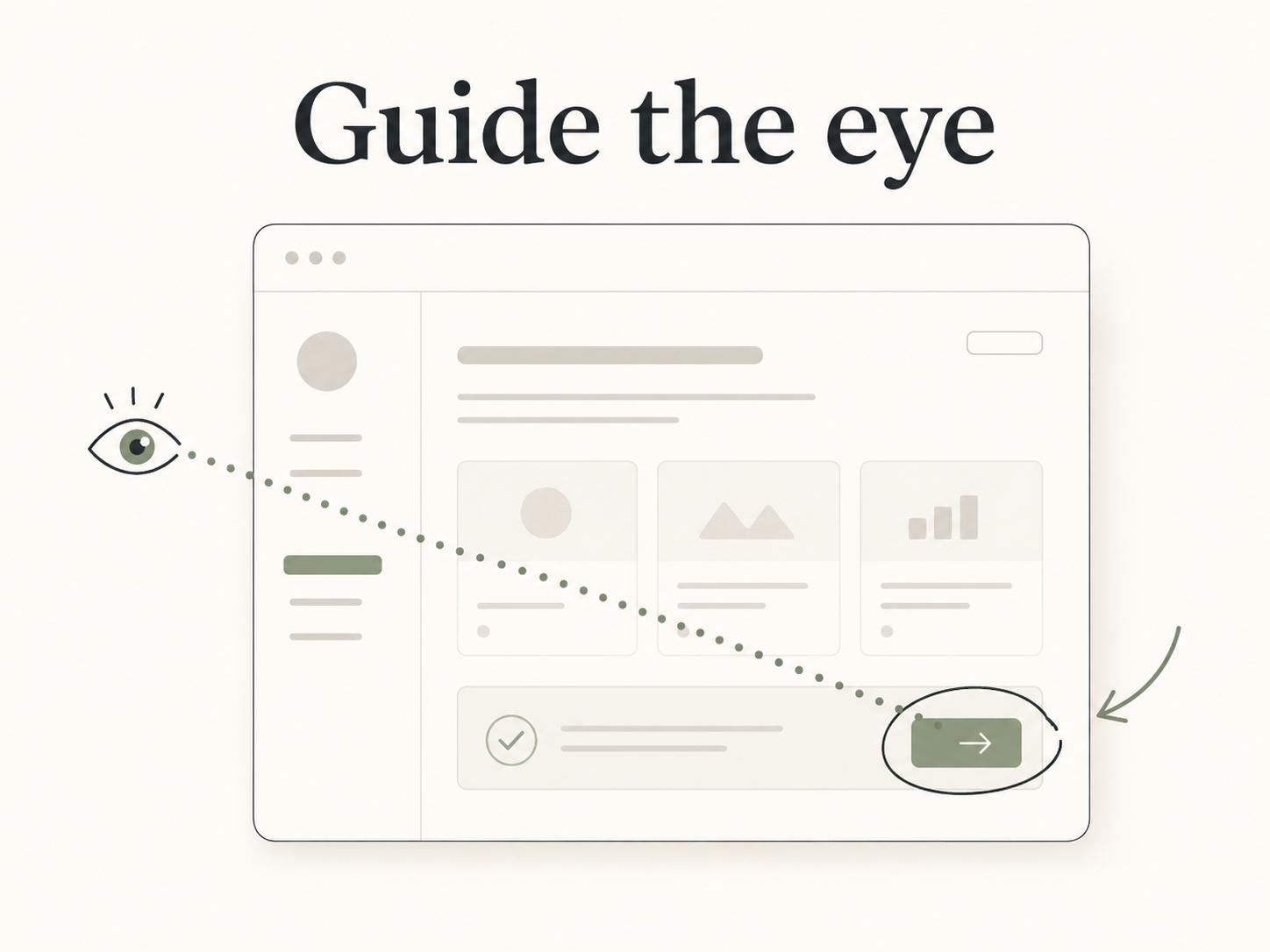
Teams use screenshot markup in product docs, SOPs, training guides, onboarding flows, bug reports, QA notes, and support replies. Good markup moves the reader's eye to the right place at the right moment.1
What screenshot markup includes
Screenshot markup can be simple or elaborate, but most useful examples rely on a small set of patterns. An arrow points to the next button. A rectangle frames the area being discussed. A numbered marker connects a screenshot to a written step.2 A blur hides customer data or internal details before the screenshot is shared.
Markup should answer a visual question the screenshot can't answer quickly on its own.3 If the reader could remove the cue and still understand the image instantly, the markup may not be needed. If the reader would stare at the screen wondering which field, menu, or state matters, markup earns its place.
A good screenshot often has less markup than people expect. One clear box around a target control is usually better than a crowded mix of arrows, circles, labels, and colored highlights.
When screenshot markup helps
Screenshot markup helps most when a screenshot contains competing details. Modern product interfaces often have sidebars, filters, tabs, dropdowns, banners, modals, and repeated buttons. A written instruction like "click Settings" can be ambiguous when there are multiple settings areas on the same screen.
Markup is also useful when the screenshot is meant to prove or diagnose something. In a bug report, a box around the broken state can save several back-and-forth comments. In a support handoff, a label can show the exact customer-facing message that should be referenced. In a training guide, numbered markers can connect the visual to the sequence of actions.
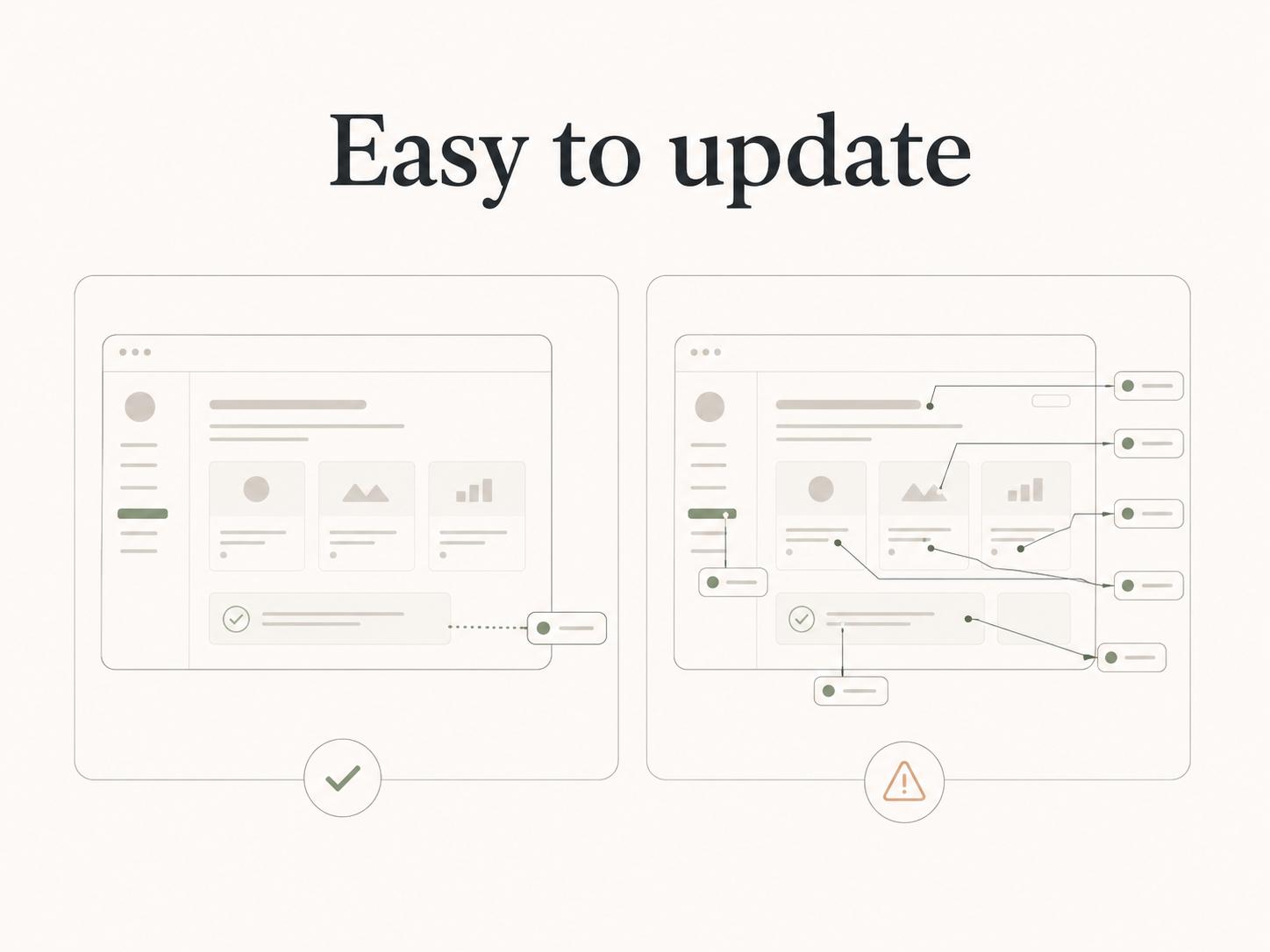
The tradeoff is maintenance. If the product UI changes, a heavily marked screenshot becomes wrong faster than a lightly marked one. Use enough markup to clarify the current task, but don't turn the image into a permanent source of tiny visual instructions that will be painful to maintain.
Common screenshot markup types
| Markup type | Best use | Watch out for |
|---|---|---|
| Arrow | Pointing to one exact control or setting | Too many arrows make the screenshot feel noisy |
| Box or outline | Framing a region, panel, error, or selected area | Thick borders can cover the UI state you need to show |
| Numbered callout | Matching image areas to written steps | Numbers need to match the copy exactly |
| Highlight | Showing selected text, a changed value, or a row | Bright highlights can distract from the interface |
| Label | Naming an unfamiliar element | Labels should not repeat obvious button text |
| Blur or redaction | Hiding private, customer, internal, or sensitive data | Blur before sharing, not after the screenshot circulates |
Use the table as an editing checklist. If the markup type doesn't match the reader's job, choose a simpler cue or remove it.
How to mark up screenshots well
Start by cropping. A tightly cropped screenshot often needs less markup because the target is already near the center of attention. If the reader only needs one menu, don't show the entire browser window unless the surrounding context matters.
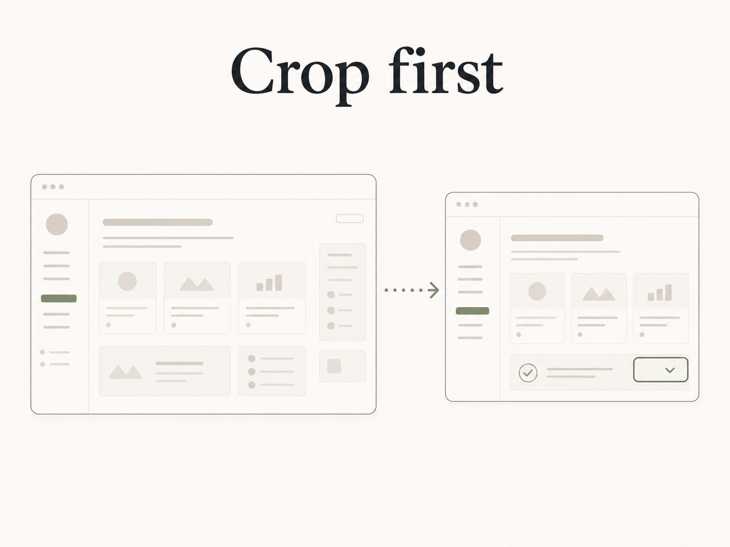
Then add the smallest useful visual cue. For a single action, that might be one box or arrow. For a sequence, use numbered markers that match the written instructions. For a privacy-sensitive workflow, blur the sensitive values before adding other callouts so the protected information is never visible in intermediate versions.4
Keep markup styles consistent across a guide. If step callouts are blue circles in one screenshot and red squares in the next, the reader has to decode the visual system instead of following the process. Consistency matters in SOPs and training materials because people often scan visuals before reading the full text.
Finally, check whether the text still stands on its own. Markup should support the instruction, not replace it. A screenshot with a giant arrow and no clear written step may be fast to create, but it's harder to search, translate, skim, and update.
Screenshot markup in documentation workflows
For documentation teams, screenshot markup is a maintenance decision as much as a design decision. Every marked screenshot creates a future update obligation. If the product changes, someone may need to retake the screenshot, reapply the markup, and confirm that the written step still matches.
Reserve markup for places where visual certainty matters: confusing controls, high-risk steps, customer-facing screens, bug evidence, admin settings, and training sequences. Use plain screenshots or no screenshots when the UI is obvious and the text is enough.
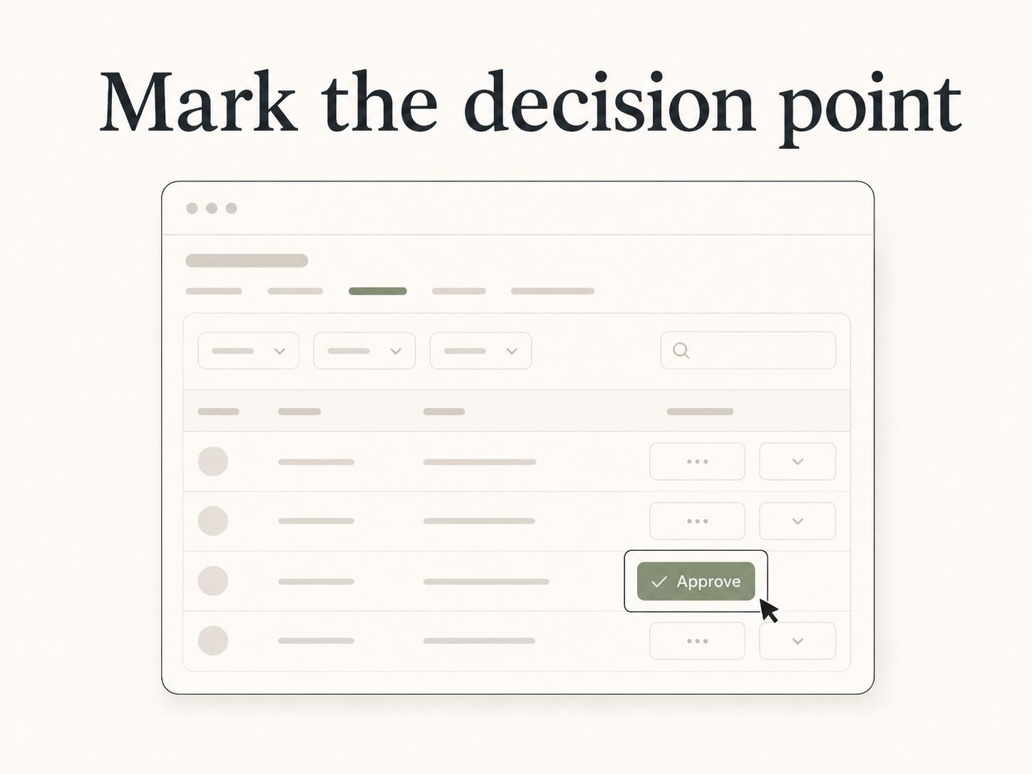
A useful rule is: mark the decision point, not the entire page. The reader usually needs to know what to click, what changed, what is wrong, or what to ignore. Mark that specific thing.
How Trails helps
Trails helps teams create visual process documentation without manually rebuilding every screenshot workflow from scratch. It captures a workflow as someone performs it, turns the capture into a polished step-by-step guide, and can create an AI-narrated video version for training or sharing.
That makes screenshot markup easier to manage because the visuals are tied to actual steps. Teams can focus on clarifying the few moments that need extra emphasis instead of manually assembling every image, caption, and handoff from a blank page.
Sources
- 1
Nielsen Norman Group. Visual Hierarchy. Nielsen Norman Group. www.nngroup.com/videos/visual-hierarchy/. Accessed July 8, 2026.
- 2
Microsoft. Lists. Microsoft Learn Style Guide. learn.microsoft.com/en-us/style-guide/scannable-content/lists. Accessed July 8, 2026.
- 3
Nielsen Norman Group. Communication, Not Decoration. Nielsen Norman Group. www.nngroup.com/videos/communication-not-decoration-ux-slogan-4/. Accessed July 8, 2026.
- 4
National Institute of Standards and Technology. NIST Finalizes Updated Guidelines for Protecting Sensitive Information. NIST. www.nist.gov/news-events/news/2024/05/nist-finalizes-updated-guidelines-protecting-sensitive-information. Accessed July 8, 2026.