
Glossary
Screenshot Annotation
 ChatGPT
 Perplexity
 Gemini
 Claude
What is screenshot annotation?
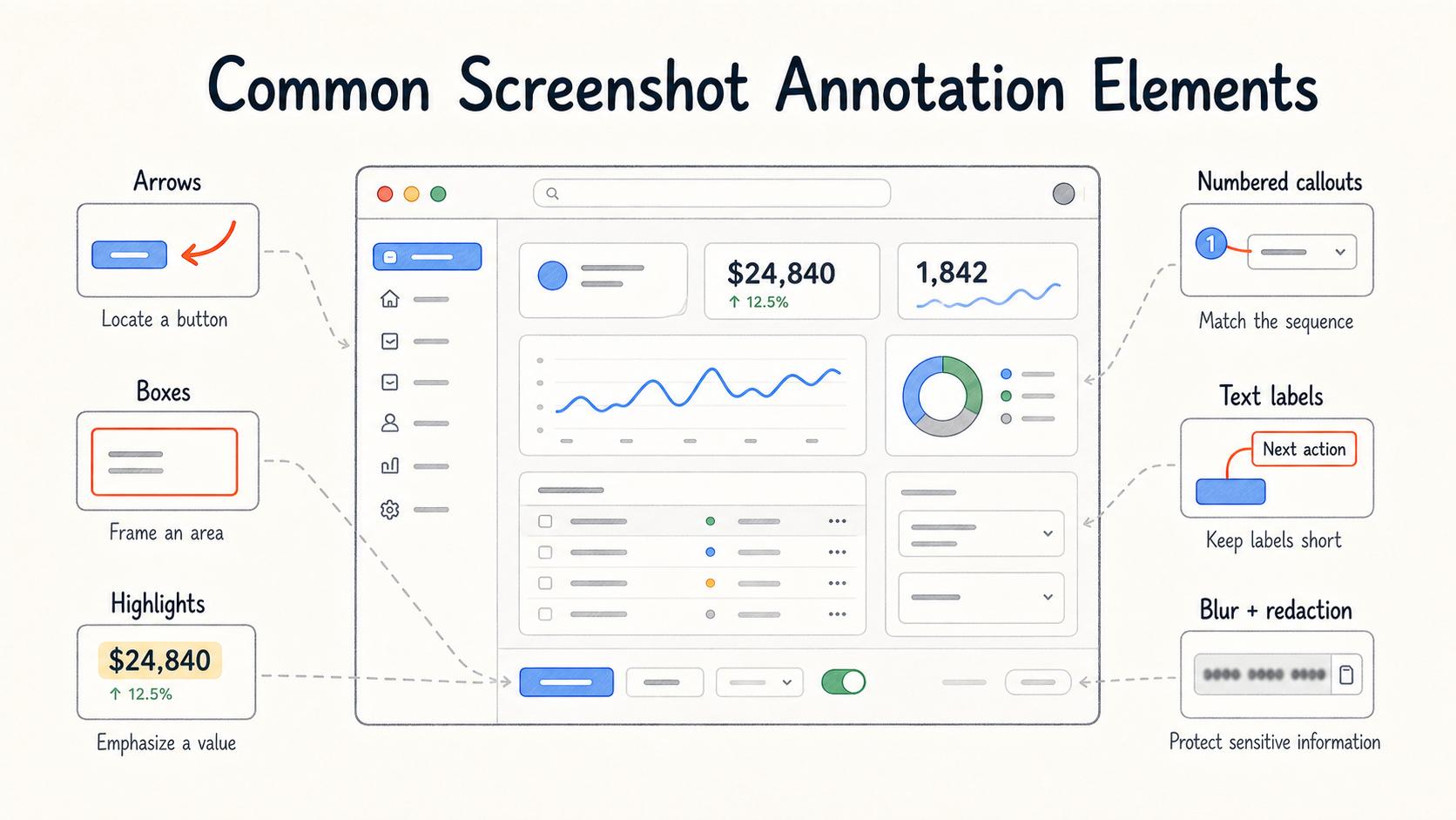
Screenshot annotation is the practice of adding explanatory marks to a screenshot so a reader knows what to notice or do next. Arrows, boxes, numbered callouts, highlights, short labels, blur, and redaction are common annotation types.
A screenshot shows what a screen looked like. An annotated screenshot turns that image into instruction. That matters in SOPs, help-center articles, onboarding guides, bug reports, and training material because the reader is usually trying to complete a task under real working conditions.
Why screenshot annotation matters
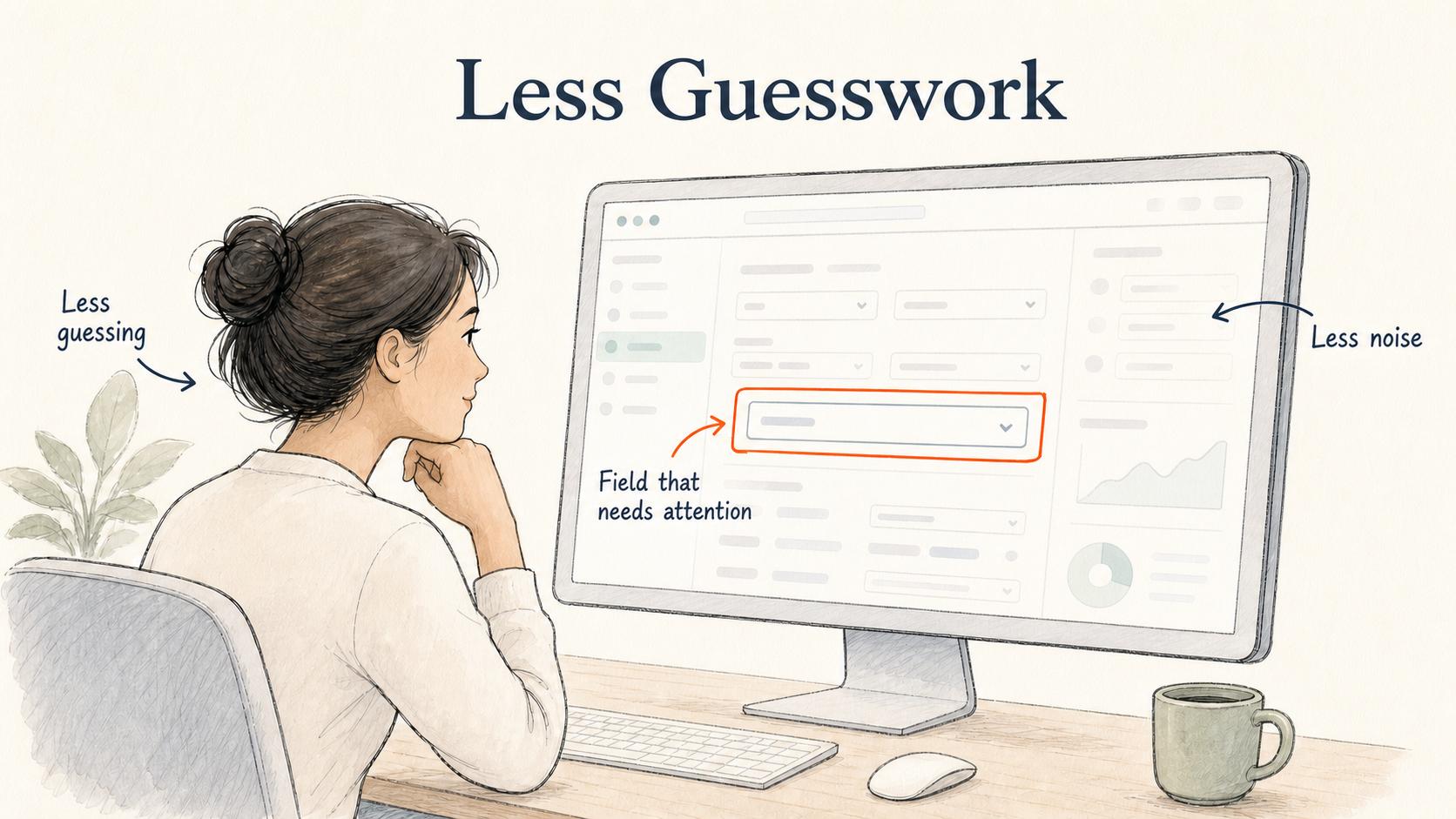
Most software screens contain more information than one step needs. A menu, sidebar, banner, modal, and form field might all be visible at once. Without annotation, the reader has to infer which part of the screenshot matters.
Good annotation reduces that guessing. It points to the field that needs attention, frames the button to click, labels the expected result, or redacts data that should not be shared. The point is to lower the reader's cognitive load at the moment they match the written instruction to the screen in front of them.1
Screenshot annotation is especially useful when two parts of an interface look similar. If a sales ops SOP tells a rep to update the renewal date in a CRM account, and the screen has several date fields, a box around the right field prevents a small misread from becoming a reporting problem.
Common screenshot annotation elements
The best annotation depends on the ambiguity you need to remove.
Arrows
Arrows help the reader locate a specific button, menu item, setting, or field. Use them sparingly; too many arrows create a scavenger hunt.
Boxes and outlines
Boxes and outlines work when an area matters more than a single point, such as a panel, form section, data row, or configuration group.
Highlights
Highlights call attention to a state, label, or value. They are less precise than boxes, so they work better for emphasis than step-by-step instruction.
Numbered callouts
Numbered callouts help when one screenshot supports several written steps. The numbering should match the written sequence exactly, or the visual aid becomes another thing to decode.2
Text labels
Text labels help when the visual element is unfamiliar. Keep labels short. If a label needs a full sentence, the sentence probably belongs in the written guide.
Blur and redaction
Blur and redaction protect sensitive information. Treat them as part of the annotation workflow, not as cleanup after publishing. A screenshot that exposes a customer name, account balance, email address, internal URL, or token should be fixed before it becomes training material.
How to decide what to annotate
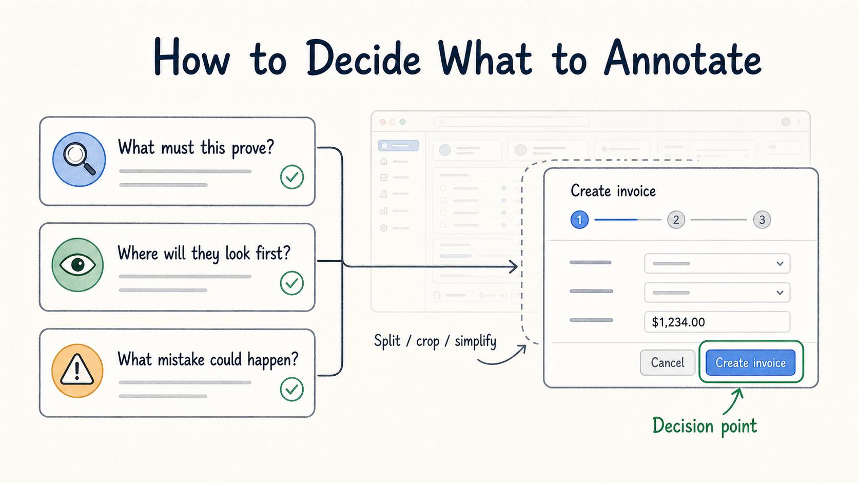
Annotate the decision point, not the whole screen.
If the reader must choose one button, annotate that button. If the reader must confirm a result, annotate the result. If the reader must avoid a common mistake, annotate the misleading option and explain the distinction in the surrounding copy.
Before adding markup, ask three questions:
- What is the one thing this screenshot needs to prove?
- Where is the reader most likely to look first, and is that the right place?
- What mistake would this annotation prevent?
Those questions keep the screenshot from becoming overloaded. A heavily marked screenshot often means the written step is doing too much. Split the step, crop the image, or capture a cleaner screen before adding more callouts.
Screenshot annotation in documentation
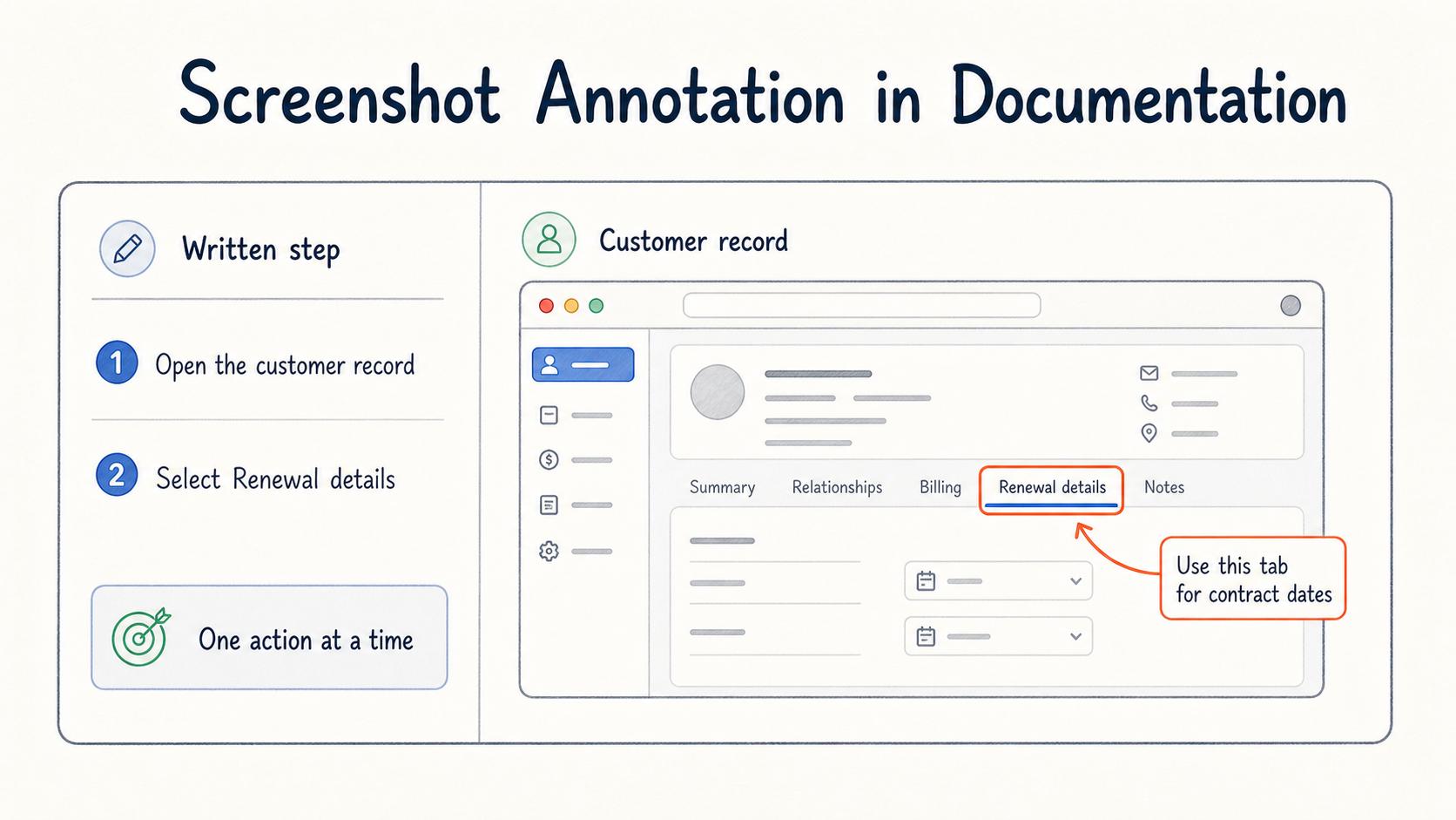
In process documentation, annotation is strongest when it supports one action at a time. The written instruction says what to do. The screenshot shows where to do it or what the result looks like. The annotation removes the last bit of ambiguity.
For example:
- The written step says, "Open the customer record and select Renewal details."
- The screenshot shows the customer record page.
- A box frames the Renewal details tab.
- A short label says, "Use this tab for contract dates."
That combination is clearer than a full-screen image with five unlabeled tabs, or a paragraph that tries to describe the screen from memory.
The tradeoff is maintenance. Annotated screenshots can become outdated quickly when software changes. Use annotations where visual precision is worth the upkeep: complex workflows, high-risk steps, new-user training, compliance steps, and support answers that get reused often.
Common mistakes
The most common mistake is annotating everything. When every button is circled, nothing feels important. Use the smallest number of marks that helps the reader complete the step.
Another mistake is using annotation to compensate for a poor screenshot. Cropping, zoom level, browser clutter, and test data all matter. Clean the screenshot first, then annotate it.
A third mistake is putting critical instructions only inside the image. Screenshots can be hard to read on small screens, in exported PDFs, or for readers using assistive technology. Important instructions should also appear in text.3
AI-ready prompt for screenshot annotation review
Use this prompt when you want AI to review a screenshot plan before publishing a guide:
## Screenshot Annotation Review Prompt

**Glossary term:** Screenshot Annotation
**Source:** Trails Glossary — trails.so/glossary/screenshot-annotation

---

### 01. Review screenshot annotation quality

"Review this documentation step for screenshot annotation quality.

Context: [describe the workflow and reader]
Written step: [paste the instruction]
Screenshot contents: [describe what appears in the screenshot]
Proposed annotations: [list arrows, boxes, labels, highlights, or redactions]

Tell me:
1. Which annotation is essential?
2. Which annotation adds noise?
3. What sensitive information should be blurred or recaptured?
4. Whether the written step and screenshot tell the same story.
5. One change that would make the image easier to maintain later."
How Trails helps
Trails captures workflows as someone performs them and turns those workflows into polished step-by-step guides. That makes screenshot annotation more practical because the visual context starts from the real process, not a manually assembled set of images. Teams can use those guides for onboarding, SOPs, support answers, and repeatable internal training.
Sources
- 1
Cambridge University Press. The Signaling (or Cueing) Principle in Multimedia Learning. The Cambridge Handbook of Multimedia Learning. www.cambridge.org/core/books/cambridge-handbook-of-multimedia-learning/signaling-or-cueing-principle-in-multimedia-learning/3972D4ACC628D5B53F7B2B4785DB2B06. Accessed July 9, 2026.
- 2
Richard E. Mayer and Roxana Moreno. Nine Ways to Reduce Cognitive Load in Multimedia Learning. swcarpentry.github.io/swc-releases/2017.02/instructor-training/files/papers/mayer-reduce-cognitive-load-2003.pdf. Accessed July 9, 2026.
- 3
W3C Web Accessibility Initiative. Understanding Success Criterion 1.4.5: Images of Text. W3C. www.w3.org/WAI/WCAG22/Understanding/images-of-text.html. Accessed July 9, 2026.